How to Generate Perfect Color Palettes for Your Brand or Website
You're designing a new website. Or refreshing your brand colors. Maybe you're a developer who needs a cohesive color scheme for a side project. You have one color you love-maybe your logo color or a shade that "feels right"-but you need the full palette. Complementary colors for buttons. Background shades. Text colors that actually pass accessibility standards.
Your options? Spend hours in color pickers guessing what works together. Use random palette generators that don't harmonize with your brand. Or hire a designer for $500+ to create a color system.
The Color Problem
Color theory is complex. Complementary, analogous, triadic, split-complementary, tetradic... understanding color harmony takes study. And even if you know the theory, finding the exact hex codes that work together is tedious.
Then there's accessibility. That beautiful light blue text on white background? It fails WCAG contrast standards. Your design looks great to you, but visually impaired users can't read it. And you won't know until someone complains or you run expensive audits.
The Solution: AI-Powered Color Harmony Generator
The Color Palette Generator creates beautiful, harmonious color palettes from any seed color. Choose from multiple harmony modes (monochromatic, analogous, complementary, triadic). Export to CSS variables, Tailwind config, SCSS, or JSON. And see real-time accessibility contrast ratings for every combination.
Why This Beats Manual Color Picking
Mathematical Harmony: Uses established color theory algorithms to generate palettes that actually work together. No more guessing.
Accessibility Built-In: Every color shows contrast ratings against white and black. Know immediately if your text/background combinations pass WCAG AA or AAA standards.
Developer-First Exports: Copy-paste ready code for CSS variables, Tailwind configuration, SCSS maps, or JSON objects. No manual conversion.
Zero Cost: Adobe Color is part of a subscription. Coolors.co has paywalls. This is completely free, no limits.
Privacy Protected: Your color choices aren't logged or analyzed. No "trending palettes" exposing your brand decisions before launch.
Harmony Modes Explained
Monochromatic: Same hue, different saturation/lightness. Safe, cohesive, professional. Best for: Corporate sites, minimalist designs, when you want one dominant brand color.
Analogous: Colors adjacent on the color wheel. Natural, harmonious, pleasing. Best for: Nature brands, organic products, calming interfaces.
Complementary: Opposite colors on the wheel. High contrast, vibrant, energetic. Best for: Call-to-action buttons, sports brands, youthful energy.
Triadic: Three evenly spaced colors. Balanced, diverse, dynamic. Best for: Complex interfaces, playful brands, when you need multiple distinct accents.
Split-Complementary: Base color plus two adjacent to its complement. Contrast with less tension. Best for: Sophisticated designs, avoiding "clash" of pure complementary.
Tetradic (Rectangle): Four colors in rectangular formation. Rich, complex, versatile. Best for: Editorial designs, creative agencies, when you need full color range.
Square: Four evenly spaced colors. Bold, balanced, experimental. Best for: Art projects, avant-garde brands, statement designs.
Key Features for Designers and Developers
Seed Color Selection
Start with any color:
- Color picker: Visual selection with hue/saturation/lightness
- Hex input: Paste exact brand colors (#7c3aed)
- Random seed: Generate inspiration with "Random Seed" button
Palette Customization
- Palette size: 3 to 8 colors (slider control)
- Saturation boost: Increase or decrease overall vibrancy
- Fine-tuning: Adjust individual colors after generation
Accessibility Contrast Panel
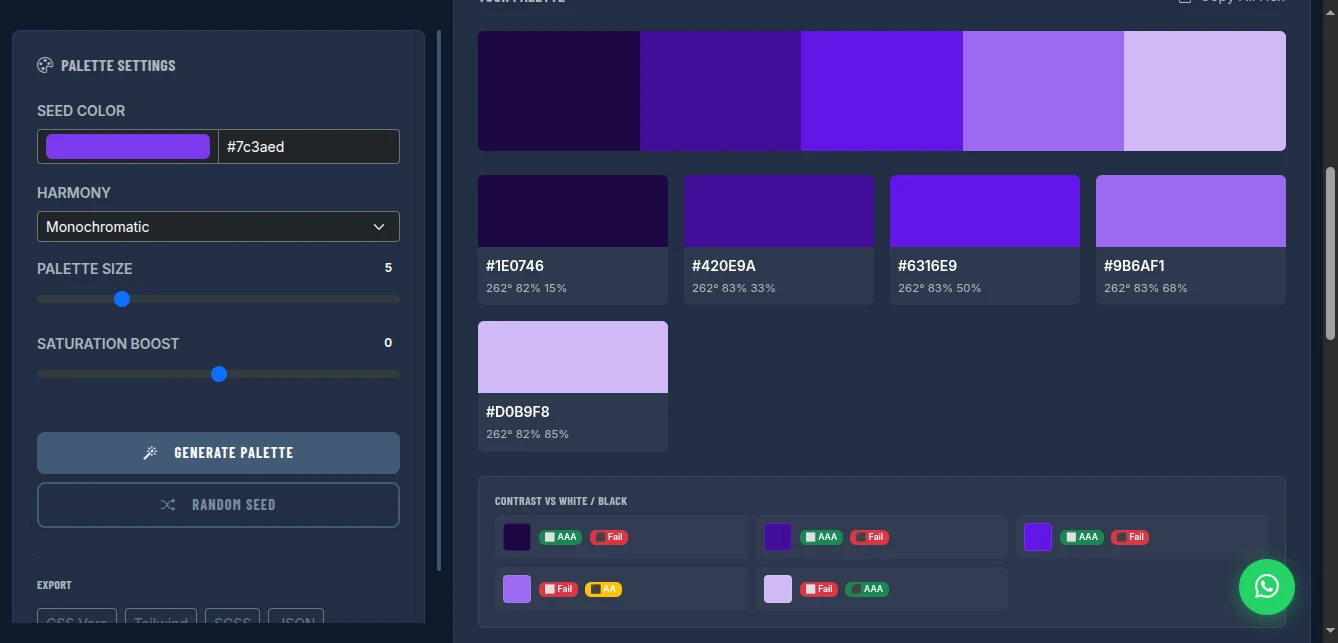
Every generated color displays:
- Contrast vs White: Pass/Fail for AA and AAA standards
- Contrast vs Black: Pass/Fail for AA and AAA standards
- Visual indicators: Green check (pass), red X (fail), yellow warning (marginal)
WCAG Standards:
- AA Normal: 4.5:1 contrast ratio minimum
- AA Large: 3:1 contrast ratio minimum (18pt+ text)
- AAA Normal: 7:1 contrast ratio minimum
- AAA Large: 4.5:1 contrast ratio minimum
Export Formats
CSS Variables:
:root {
  --color-1: #1e0746;
  --color-2: #420e9a;
  --color-3: #7c3aed;
  --color-4: #9b6af1;
  --color-5: #d0b9f8;
}
Tailwind Config:
colors: {
  brand: {
    1: '#1e0746',
    2: '#420e9a',
    3: '#7c3aed',
    4: '#9b6af1',
    5: '#d0b9f8',
  }
}SCSS:
$colors: (
  '1': #1e0746,
  '2': #420e9a,
  '3': #7c3aed,
  '4': #9b6af1,
  '5': #d0b9f8
);JSON:
{
  "colors": [
    {"name": "color-1", "hex": "#1e0746", "hsl": "262° 82% 15%"},
    {"name": "color-2", "hex": "#420e9a", "hsl": "262° 83% 33%"}
  ]
}
How to Use It: From Seed to System
Step 1: Set Your Seed Color
Enter your brand color or inspiration color:
- Type hex code directly
- Use color picker for visual selection
- Click "Random Seed" for inspiration
Pro tip: Start with your most recognizable brand color, or the color that represents your brand personality.
Step 2: Choose Harmony Mode
Select based on your design goals:
- Safe/professional → Monochromatic or Analogous
- Bold/energetic → Complementary or Triadic
- Balanced/complex → Split-Complementary or Tetradic
Step 3: Adjust Palette Size
Use the slider to set how many colors you need:
- Simple sites: 3-4 colors (primary, secondary, accent, text)
- Complex apps: 5-6 colors (primary scale, semantic colors)
- Design systems: 7-8 colors (full spectrum with variations)
Step 4: Fine-Tune with Saturation Boost
Adjust overall vibrancy:
- Increase (+20 to +50) for bold, modern brands
- Decrease (-20 to -50) for muted, sophisticated palettes
- Keep at 0 for balanced, true-to-theory harmony
Step 5: Check Accessibility
Review the contrast panel:
- Look for green "AA" and "AAA" badges
- Avoid red "Fail" indicators for text/background pairs
- Use yellow "AA Large" only for headings/big text
Critical combinations to check:
- Darkest color on white (body text)
- Primary color on white (buttons/links)
- White on darkest color (inverted sections)
Step 6: Export and Implement
Click your preferred format:
- CSS Vars: Paste into
:rootin your stylesheet - Tailwind: Extend
theme.colorsintailwind.config.js - SCSS: Import into your variables file
- JSON: Use for design tokens or JavaScript theming
Real-World Use Cases
Startup Brand Identity
Scenario: Tech startup needs full color system from logo purple (#6366f1)
Process:
- Enter #6366f1 as seed
- Select "Analogous" for harmonious, approachable feel
- Generate 5-color palette
- Check accessibility: darkest shade passes AA on white
- Export to Tailwind config
Result: Complete design system in 2 minutes. Primary, secondary, accent, background, and text colors that all harmonize.
Website Redesign
Scenario: Refresh corporate site, keep existing navy (#1e3a8a) but modernize
Process:
- Enter #1e3a8a as seed
- Select "Monochromatic" for professional cohesion
- Generate 6-color scale (darkest for text, lightest for backgrounds)
- Verify all text/background combinations pass WCAG AA
- Export CSS variables
Result: Graduated color scale from navy to near-white. Consistent hover states, section backgrounds, and text hierarchy.
E-commerce App
Scenario: Need semantic colors (success, error, warning, info) that match brand
Process:
- Generate brand palette first (monochromatic from brand color)
- Create separate palettes for semantic colors:
- Green seed for success states
- Red seed for error states
- Yellow seed for warnings
- Blue seed for info
- Export all to CSS variables
- Map semantic names to palette slots
Result: Complete design token system with brand-consistent semantic colors.
Pro Tips for Professional Palettes
Start with Emotion: Colors evoke feelings. Blue = trust. Red = urgency. Green = growth. Yellow = optimism. Choose your seed based on brand emotion, not just "what looks good."
Test in Context: Export and test colors in actual UI elements. A color that looks great in isolation may not work for buttons or text.
Consider Dark Mode: Generate two palettes-one for light mode, one for dark. Or use the same palette but assign different slots (lightest becomes background in dark mode).
Limit Your Palette: 3-4 colors is often enough. Every additional color increases complexity and reduces cohesion.
Document Usage: Create a style guide showing which colors are for:
- Primary actions (buttons, links)
- Secondary actions (cancel, back)
- Backgrounds (page, cards, sections)
- Text (headings, body, captions)
- Semantic states (success, error, warning)
Check Color Blindness: Use tools like Stark or Color Oracle to verify your palette works for color-blind users. Red-green combinations are particularly problematic.
Comparison with Alternatives
| Feature | Adobe Color | Coolors.co | ColorHunt | This Tool |
|---|---|---|---|---|
| Cost | Subscription | Freemium | Free | Free |
| Harmony Modes | Yes | Limited | No | 7 modes |
| Accessibility Check | Basic | Basic | No | Detailed |
| Export Formats | Limited | Limited | Hex only | CSS/Tailwind/SCSS/JSON |
| Privacy | Cloud | Cloud | Cloud | Browser-only |
| Customization | Good | Good | None | Full control |
| No Account | No | No | No | Yes |
Limitations and Workarounds
No Save Function: Palettes aren't saved to cloud. Workaround: Export immediately. Save the hex codes in your project documentation.
No Image Color Extraction: Can't upload logo/image to extract colors. Workaround: Use browser devtools color picker on your image, or tools like Image Color Picker, then paste hex here.
No Gradient Generation: Creates solid colors only. Workaround: Use CSS linear-gradient() between palette colors for gradients.
No Real-Time Preview: Can't see palette applied to mock UI. Workaround: Export to your design tool or code editor immediately, apply to components, iterate.
Conclusion
Stop guessing which colors work together. Stop paying subscriptions for basic color theory. Stop discovering accessibility failures after launch.
The Color Palette Generator gives you mathematically harmonious colors with built-in accessibility checking and developer-ready exports. From seed color to complete design system in minutes-not hours.
Professional color theory. Zero cost. Complete privacy.
Generate your perfect color palette now - no signup required.